Following on from some of the previous exercises, I have converted one of my older film images to black & white. I chose this shot of a new exhibit going up in the Tate Modern, as it has a bit of tonal range.
Similar to an earlier exercise I had to do a bit of dust spot removal. In several instances this did mean having to choose between dust spots and real marks on the floor.
Sunday, 23 September 2012

Wednesday, 19 September 2012
Improvement or interpretation?
The following image has undergone some processing similar to traditional dodging and burning. I have isolated the figure and pallet using the polygonal lasso tool and feathered the edge of the selection by a few pixels in an attempt to soften the edge of the cut-out. Then I have worked with a levels adjustment layer, the objective being to lightening the figure.
I have tried to lighten the figure without the end result looking 'false'. I think this has worked very well.
The exercise is again asking me to consider the limits of this image manipulation. I find the level of work carried out here quite acceptable. Even if I had lightened the figure more, I don't feel it is telling an 'un-truth' although the image will look false. My reasoning for this is that the image is still displayed as it was seen albeit a little lighter.
This is of course all highly subjective. Other photographers my have different opinions. My own opinions differ depending on the final use of the image.
I have tried to lighten the figure without the end result looking 'false'. I think this has worked very well.
 |
| Portrait with selection altered with levels. |
The exercise is again asking me to consider the limits of this image manipulation. I find the level of work carried out here quite acceptable. Even if I had lightened the figure more, I don't feel it is telling an 'un-truth' although the image will look false. My reasoning for this is that the image is still displayed as it was seen albeit a little lighter.
This is of course all highly subjective. Other photographers my have different opinions. My own opinions differ depending on the final use of the image.

Monday, 17 September 2012
Cecil Beaton Exhibition
In a previous post I looked at the work of Cecil Beaton. I have just found out that the Imperial War Museum is hosting an exhibition entitled "Cecil Beaton: Theatre of War" which runs from the 6th September 2012 until the 1st January 2013. (link)
I will be making every effort to visit this exhibition!
I will be making every effort to visit this exhibition!
Monday, 10 September 2012
Correction
This chapter encourages us to explore the boundaries of what constitutes 'fake' and 'real'.
With modern technology we have complete control over the image that is presented, much more so than with traditional photography. With skill and practice it is possible to create completely fictitious photographic situations. By some this is considered art, others may see it as fraud. To better understand my own feelings on this subject and to find where I myself draw the line between tidying up a picture and distorting the truth, I am editing the following two images from the course web site. The two images provide two different editing situations.
In the first image I am going to clean up dirt spots. As most of the image consists of similar dust marks, I have shown a section of the image at 100%.
My own feelings about this first exercise are feelings of frustration! The photographed objects appear to be of some kind of transparent substance, i.e. glass or resin. The objects have dark marks all over them but it is not clear if these are dust spots or some property of the materials. As I did not photograph the objects and have never seen the real thing, I am finding it very difficult to be sure that some of the dust spots I am correcting are actually dust spots! It can be argued that somebody looking at the end results would have been unaware of the original marks but then they are falling prey to my version of what was in front of the lens.
For the second part of this exercise I have to remove some lens flare, seen on the left hand side of the image below. I have used the clone tool in Photoshop, set to colour to remove as much of the flare as possible.
This was very difficult to carry out as there is not always a clean area to clone from. As before, it is not always possible to see what the underlying colour and texture should be. I spent quite a lot of time doing this and still believe it was not long enough and could have been done better.
What are my thoughts about this though? Well this was slightly easier to work on than the previous shot as it was easier to relate to what is being shown. Removing the flare in this instance has made for a more enjoyable picture. A big part of me still thinks it would have been better to get the shot without the flare, after all, had I made a better job of the cloning would only prove that I am good at Photoshop, not necessarily photography!
With modern technology we have complete control over the image that is presented, much more so than with traditional photography. With skill and practice it is possible to create completely fictitious photographic situations. By some this is considered art, others may see it as fraud. To better understand my own feelings on this subject and to find where I myself draw the line between tidying up a picture and distorting the truth, I am editing the following two images from the course web site. The two images provide two different editing situations.
In the first image I am going to clean up dirt spots. As most of the image consists of similar dust marks, I have shown a section of the image at 100%.
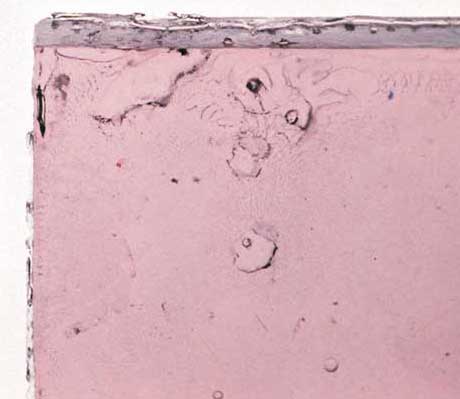 |
| Before clean up with dust spots in place. |
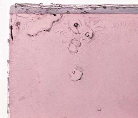 |
| Without dust spots. |
For the second part of this exercise I have to remove some lens flare, seen on the left hand side of the image below. I have used the clone tool in Photoshop, set to colour to remove as much of the flare as possible.
 |
| The original image with flare visible on the left. |
 |
| Lens flare removed with clone tool set to colour. |
Monday, 27 August 2012
Assignment 3. Monochrome
This assignment is a study in monochrome. From our previous exercises we have learnt that some subjects are better suited to black and white than others. We are looking for different qualities than we would, should we be working in colour. Here the qualities of contrast, tonal range, form and texture become important.
In the lead up to this assignment I have been looking at black and white work from other artists including Harry Callahan, Ansel Adams, Cecil Beaton and Henri Cartier-Bresson. Interesting to see the different subject matters covered in black and white.
Why I have chosen this subect
I have chosen as my subject the pier in Bognor Regis, my home town. I believe the pier offers many opportunities for textures as well as shape and form. Much more than this though, I also feel that the pier is suitable on another level. Most of the piers in England date from around the turn of the previous century. Black and white photography always raises this nostalgic feeling in me. I see a tie between the subject and the medium.
On yet another level, a pier and it's visitors in colour can be a happy and joyful place but when photographed in monochrome and in less than favourable holiday conditions and the emptiness can take on a melancholy atmosphere. This is what I am setting out to capture in the following images.
Conclusion
My objective was to show a moody, melancholy side of the pier. The pier is definitely moodier in black and white than when you look at the colour versions of the photographs. Looking at the images now, I feel that I have one very cliché image (it should be obvious which one!). Maybe the weather could have been a bit more 'moody' but I made several visits to the pier and in the end had to go with what I had captured.
I am quite happy with the processing. Black and white manipulation is something I haven't carried out often. There seemed to be a big craze in the last couple of years and I hate to follow the crowds, so I deliberately avoided this genre. This exercise forced me to experiment with black and white and I did enjoy it.
Picture details
Clutter. Canon EOS 5D MKII, 35mm Lens, 1/100 @F11, iso 50.
Pier time. Canon EOS 5D MKII, 35mm Lens, 1/250 @F8, iso 50.
My shadow. Canon EOS 5D MKII, 35mm Lens, 1/2500 @F2, iso 50.
Walk the plank. Canon EOS 5D MKII, 35mm Lens, 1/100 @F8, iso 50.
Holiday spirit. Canon EOS 5D MKII, 50mm Lens, 1/30 @F16, iso1000.
Under the board walk. Canon EOS 5D MKII, 50mm Lens, 1/160 @ F2.8, iso 1000.
Wish you were here. Canon EOS 5D MKII, 50mm Lens, 1/500 @ F5.6, iso50.
Finally, below are a small sample of the images that I took for this assignment.
In the lead up to this assignment I have been looking at black and white work from other artists including Harry Callahan, Ansel Adams, Cecil Beaton and Henri Cartier-Bresson. Interesting to see the different subject matters covered in black and white.
Why I have chosen this subect
I have chosen as my subject the pier in Bognor Regis, my home town. I believe the pier offers many opportunities for textures as well as shape and form. Much more than this though, I also feel that the pier is suitable on another level. Most of the piers in England date from around the turn of the previous century. Black and white photography always raises this nostalgic feeling in me. I see a tie between the subject and the medium.
On yet another level, a pier and it's visitors in colour can be a happy and joyful place but when photographed in monochrome and in less than favourable holiday conditions and the emptiness can take on a melancholy atmosphere. This is what I am setting out to capture in the following images.
 |
| Clutter. |
 |
| Pier time. |
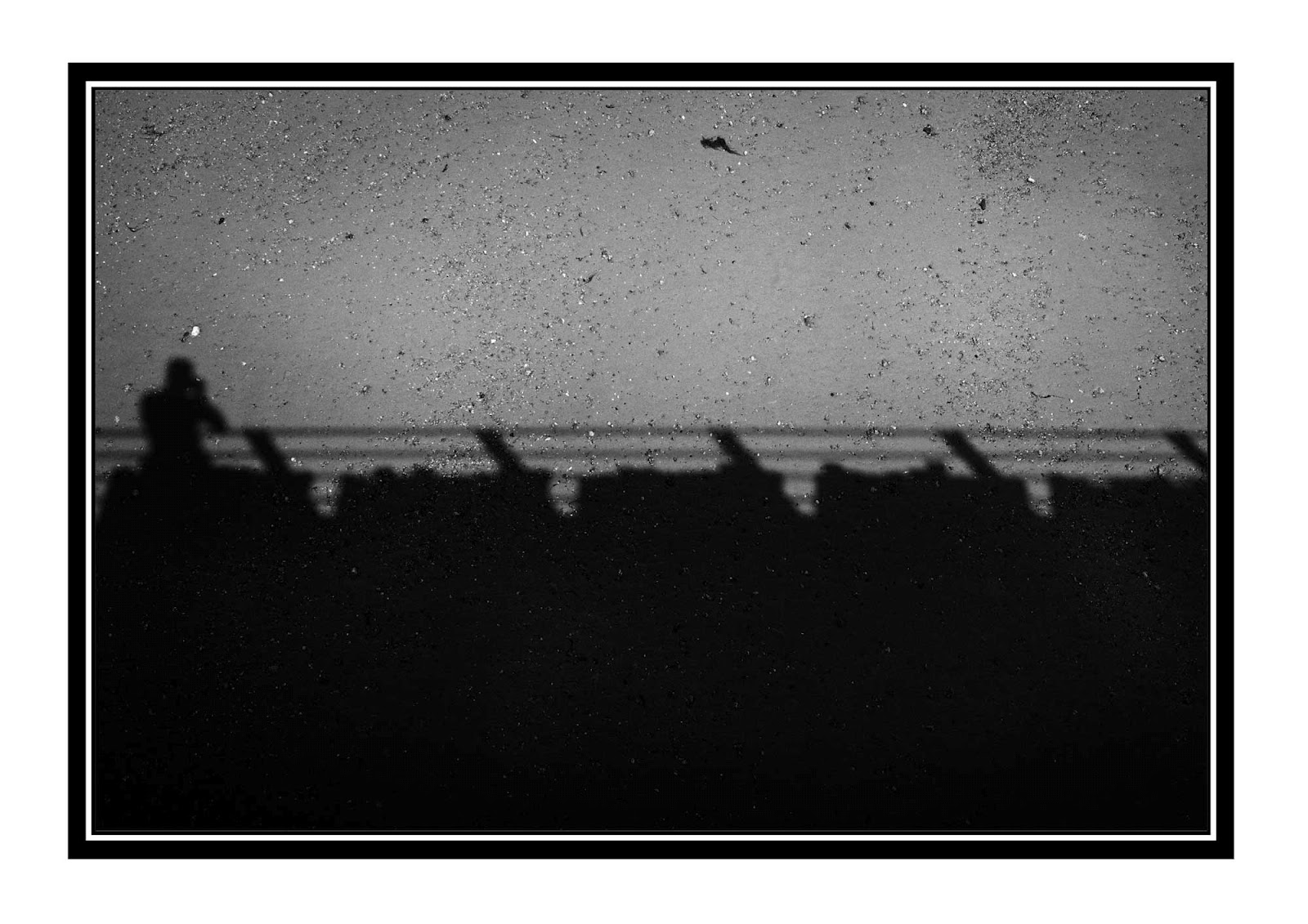 |
| My shadow. |
 |
| Walk the plank. |
 |
| Holiday spirit. |
 |
| Under the board walk. |
 |
| Wish you were here.... |
My objective was to show a moody, melancholy side of the pier. The pier is definitely moodier in black and white than when you look at the colour versions of the photographs. Looking at the images now, I feel that I have one very cliché image (it should be obvious which one!). Maybe the weather could have been a bit more 'moody' but I made several visits to the pier and in the end had to go with what I had captured.
I am quite happy with the processing. Black and white manipulation is something I haven't carried out often. There seemed to be a big craze in the last couple of years and I hate to follow the crowds, so I deliberately avoided this genre. This exercise forced me to experiment with black and white and I did enjoy it.
Picture details
Clutter. Canon EOS 5D MKII, 35mm Lens, 1/100 @F11, iso 50.
Pier time. Canon EOS 5D MKII, 35mm Lens, 1/250 @F8, iso 50.
My shadow. Canon EOS 5D MKII, 35mm Lens, 1/2500 @F2, iso 50.
Walk the plank. Canon EOS 5D MKII, 35mm Lens, 1/100 @F8, iso 50.
Holiday spirit. Canon EOS 5D MKII, 50mm Lens, 1/30 @F16, iso1000.
Under the board walk. Canon EOS 5D MKII, 50mm Lens, 1/160 @ F2.8, iso 1000.
Wish you were here. Canon EOS 5D MKII, 50mm Lens, 1/500 @ F5.6, iso50.
Finally, below are a small sample of the images that I took for this assignment.
 |
 |
Sunday, 12 August 2012
A look at "Unseen Vogue"

The description for the book read "For every picture that has been published in Vogue, there are many that never make it - not because of poor composition or execution, but because the fashion styling may have been too inventive, the camera technique too pioneering or, frequently, because the magazine simply ran out of space"
This was tantalising enough so I ordered the book immediately and it duly arrived a few days later.
I was not disappointed. The book has turned out to be much more relevant to the course than I expected. Between the pages we find work from many of the great masters - Horst, George Hoyningen-Huene, Cecil Beaton, Lee Miller, Barry Lategan, Corinne Day, David Bailey and Helmut Newton as well as others that I will be researching further. As the description states this book contains pictures that didn't make it in to Vogue. It is incredibly interesting to see this work and the reasons for this decision. Many of the pages also contain contact sheets so we can get a view of the different poses and ideas the photographers, models and art directors have tried.
Further to all these gems, there are also notes and letters of conversations between Vogue editors and photographers. Finally, you get to see some new shots of some of our greatest models going back to the beginning of Vogue.
All in all this is a great photographers book if you have the slightest interest in fashion photography.
Little, Brown. 2002. ISBN 978-0-316-72766-2
RAW
The advantages of using RAW for image capture are generally accepted to be the ability to carry out non destructive and post acquisition editing which allows us to hold the image quality until a later stage of the image processing cycle.
This exercise is to put in to perspective how noticeable this benefit actually is in real terms.
I have captured three images with different lighting set-ups. Each image has been captured as a RAW file as well as a JPEG (at highest quality). On my camera I am able to do this simultaneously, so both files will have identical lighting etc. To minimise the amount of post processing, I have set the camera up to give the best possible image at the time of shooting, i.e. white balance, exposure etc.
The first two images were taken in a local church yard. Very little tweaking was required on the RAW file. A little more was required for the jpeg as there was still a slight colour and brightness difference compared to the RAW version.
Comparing the two images at all stages I noticed the following. As previously mentioned the jpg file was slightly different to the RAW, straight out of the camera. The jpeg was darker and colder than the RAW. Some adjustment to the brightness, contrast and colour curves brought the two images into line.
After this work I examined both images at 100%. I checked for the presence of fringing around the edges of shapes and noise in the darker areas of the image. This image has a very shallow depth of field which allowed me to examine both sharp and soft area's.
An examination at 100% did not really reveal anything that I would worry about. There was no fringing and the noise in the darker areas was no worse than in the RAW version of the file. In the two images above you are able to see the slight difference in the colour tone but as both pictures have been converted to Jpeg, it is naturally not possible to see the differences between RAW and Jpeg. In this lighting situation the dynamic range of both shots is the same.
Image pair number two were shot in artificial light. For this I used a two flash-gun set-up with the main light to the left of the camera through a shoot through umbrella and the second flash to the right with no modifier except the flip down diffuser on the front of the flash. The camera was set to flash white balance and tripod mounted.
Again there were differences to the Jpeg and RAW files as they came from the camera. The Jpeg was again a flatter image and needed a bit more adjustment to brightness and contrast. In my images there was very little tolerance when adjusting the contrast. There was very little adjustment to be had between the highlight clipping warning and the shadow clipping warning. This was apparent in the white of the flowers and the black of background.
Again an examination at 100% showed very little to be concerned about with regards to the image quality. I paid particular attention to the edges of the white flower petals against the black background. It will be interesting to see if this is the case with the last two images!
There are two more images needed to complete this exercise, which will be high contrast.
This exercise is to put in to perspective how noticeable this benefit actually is in real terms.
I have captured three images with different lighting set-ups. Each image has been captured as a RAW file as well as a JPEG (at highest quality). On my camera I am able to do this simultaneously, so both files will have identical lighting etc. To minimise the amount of post processing, I have set the camera up to give the best possible image at the time of shooting, i.e. white balance, exposure etc.
The first two images were taken in a local church yard. Very little tweaking was required on the RAW file. A little more was required for the jpeg as there was still a slight colour and brightness difference compared to the RAW version.
 |
| Jpeg from RAW file. |
 |
| Edited Jpeg. |
After this work I examined both images at 100%. I checked for the presence of fringing around the edges of shapes and noise in the darker areas of the image. This image has a very shallow depth of field which allowed me to examine both sharp and soft area's.
An examination at 100% did not really reveal anything that I would worry about. There was no fringing and the noise in the darker areas was no worse than in the RAW version of the file. In the two images above you are able to see the slight difference in the colour tone but as both pictures have been converted to Jpeg, it is naturally not possible to see the differences between RAW and Jpeg. In this lighting situation the dynamic range of both shots is the same.
Image pair number two were shot in artificial light. For this I used a two flash-gun set-up with the main light to the left of the camera through a shoot through umbrella and the second flash to the right with no modifier except the flip down diffuser on the front of the flash. The camera was set to flash white balance and tripod mounted.
Again there were differences to the Jpeg and RAW files as they came from the camera. The Jpeg was again a flatter image and needed a bit more adjustment to brightness and contrast. In my images there was very little tolerance when adjusting the contrast. There was very little adjustment to be had between the highlight clipping warning and the shadow clipping warning. This was apparent in the white of the flowers and the black of background.
Again an examination at 100% showed very little to be concerned about with regards to the image quality. I paid particular attention to the edges of the white flower petals against the black background. It will be interesting to see if this is the case with the last two images!
 |
| RAW Conversion. |
 |
| Edited Jpeg. |
Subscribe to:
Posts (Atom)