Thursday, 13 February 2014

Assignment 5. Personal project

A few miles from my home stands an old lime works which was closed around the mid seventies. In the quarry itself some heavy machinery stands rotting away and in the works, where the lime was processed, several buildings and a row of kilns can still be seen. The whole place has a quiet, ghostly feel to it. Yet everywhere are little reminders of human activity, be it from the days of the lime works or the more recent mark of the vandal or fly-tipper.


I chose this site as the subject matter for my final assignment feeling it provided the opportunity to exploit many of the disciplines that were covered throughout Digital Photographic Practice. The medium had of course to be black and white. With so  many textures to be found, black and white editing would surely be the best way to show them. Colour would also present a huge distraction as there were so many colours to be seen in the rotting, decaying materials. Black and white editing would also go a long way to help conveying some of the solemn atmosphere.


Several visits were made over the course of some six months and the site was photographed from all angles and viewpoints, capturing wide through to detail shots. Most photography was carried out with a small collection of lenses, a 17 to 40mm zoom, a 50mm prime and a 35mm prime, sometimes using a tripod, sometimes hand held. Editing then started on the substantial collection of images.


My original intention had been to keep the image ratio the same as the camera’s but as I was editing and experimenting I performed a 1 x 1 crop on one image. This was very effective and I decided to make the entire collection square format. I wish I had thought of this before shooting as I made the job of editing much more difficult for myself! As I had not shot for the square format there were several shots I wanted to use that just did not work. to make matters worse, it proved subsequently impossible to go back and get the shots again as we had started what must be the wettest winter ever! oh well.


As I was converting my images to black and white, I found a little technique that added a lot of drama to each picture. I deliberately did not add any grain to the shots as I am not trying to ‘fake’ an old photo, rather just trying to catch the atmosphere and textures.

The finished images can be seen below. I am happy with the end result - in fact happier than I was when I started editing. At one point I had almost lost faith in the project, maybe through familiarity, maybe just in the concept but as I carried on editing the original idea started to push through again. I hope this comes across in this series, which is meant to be viewed starting from the top image and proceeding downwards.


Monday, 10 February 2014

A web gallery

The web gallery project is an interesting idea. I have at this stage not created a custom gallery from scratch but utilised some available services on the internet, both of them free.

For quite some time I have been running a Flickr account to showcase some of my work. This holds just under 300 images at the time of writing. When using Flickr you have the ability to create folders and sets, a way to categorise your work.

My Flicker photo-stream can be found here, but there is also a Flickr widget on the right hand side of this page.

As my main interest is in portrait/fashion photography, I have also created a second site using Tumblr. This is again free and I have selected a default template with minimalistic features. The Tumblr site also has blogging capabilities and is intended for micro-blogging. This can be handy for little notes about your work which will appear in the image stream.

My Tumblr site can be found here.

Both sites perform slightly different roles and have different viewing capabilities. Flickr provides a more structured layout where you can select the category of work you want to look at whereas Tumblr provides the means to just sit back and scroll through the images, one after the other in a sort of vertical timeline fashion.


Friday, 17 May 2013

Assignment 4. Real or fake?

This assignment concludes chapter four. Much of this chapter has revolved around the fact that it is now extremely easy to manipulate an image and that,with some careful work, it is possible to change the image in such a way that it no longer represents the truth. We have been asked to consider our own stance on this moral issue.

I am personally very clear about how I feel. In any context where the image is to represent news or factual information, I feel there should be no tinkering with the exception of some editing for clarity, such as lightening etc. Any images used to sell a product, should accurately depict this product. However, any associated imagery is not to be believed, and in my book is free for personal interpretation. Classic cases in question are models and their often digitally enhanced appearance. Fine art photography is a subject on to itself and anything goes.

For this assignment I have been asked to make a book cover and give my ethical justification for any work carried out on the image(s).

First, here is the cover...


The technical aspect

The cover consists of three images over a black background. The two obvious images are of course the noose and the hangman. There is a third image of some blurry trees which I will mention in more detail in a moment. Take a look at the images in their original form.


It is immediately apparent that some processing was carried out. Here's what I did.

Starting with a black background in Photoshop, I added a new layer with the tree image. This layer was set to about 90% opacity. Next, my friend Vincent was added to a new layer. To this I added a layer mask and with a large, soft brush painted out above his top hat and around his hands. The Vincent layer was set to overlay which allowed some of the trees to show through. Now, about the trees. If I had gone straight to the layer with Vincent, the Hangman, the image was to clean and lacked any form of atmosphere. Although you cannot see the trees in the finished image, they form a nice 'misty' texture and add a bit of mystery.

Before moving on to the layer with the noose, I added some soft 'black to transparent' gradients. some originating from the bottom left to blend Vincent in a bit better and one from the top down to create the dark area under the main title.

Next, the noose was added and the unwanted parts of the noose image were removed by way of another mask  For the final step text was added for the title and the strap line.

Ethical justification

I initially thought that there was no requirement for any ethical justification for the cover of a paperback novel but as I was typing it dawned on me that actually there is. The book I have chosen to represent is fictitious but if you were to take a guess at the content I suspect you would be thinking along the lines of Victorian based crime/horror story. This would indeed tally with what I imagined the book to be about. Imagine your horror then, if the book actually was a love story set in the year 3560! I would have deceived you with the cover and if you had hurriedly picked the book up at the airport with no time to read the synopsis, I wager you would be pretty unhappy on that flight! Therefore, I do have an  ethical obligation to represent the contents of the book accurately. 

With regard to the content of the picture? Well Vincent is a jolly nice chap and would never hang anybody. He is aware that the image would be used to picture him as a hangman, so there is no ethical dilemma here. Had I snapped a complete stranger and then used the image in the same manner I would be acting in a non ethical manner and could possibly end up in trouble.


Monday, 1 April 2013

Alteration

In this last exercise of part 4, I am going to edit a photograph to show a complete untruth, by removing an element. Take a look at the picture below...

Not a very exciting picture but I spotted this lady with her dog when I was out walking. I did like the decorations on the sea wall though, and the fact that the dog was looking over the wall like it's owner.

This isn't actually what I took with the camera though. There was also a boy in the group. Scroll down to the end of this post to see the original picture.

The tools I used for this task were primarily the clone stamp tool, a little use of the patch tool and the selection tool in Photoshop.

I started by using the patch tool to get rid of most of the boy's upper body which was hiding the sea behind. Then using the clone tool I cleaned this up and cloned out the boys legs. Creating the missing part of the crab required me to copy the section that was visible on the wall and then flip this to create the missing area. This required a bit more cloning to fill in some missing gaps. Finally I used the clone tool again to cover any left-over bits.

As well as a straight replacement of areas I didn't want in the completed image, I also had to use my imagination a little. The shadow area on the path had to be adjusted so as not to show the shadow of the boy any longer. This took a little bit of guess work on my be-halve but hopefully I have just removed the boys shadow.

The picture I originally took is shown below...

Sunday, 17 March 2013

Back Again

There has been a four month gap in my work. Regrettably my father passed away in Sept 2012. He lived in Malta and the time and organisation required to settle the arrangements has been tremendous. Furthermore, the circumstances of his death really dampened my enthusiasm for photography and my interest in studying.

The time has come to put that all behind me now and get back in the swing of things. I have dusted of my books and camera and now feel ready to pick up where I left off.

Sunday, 30 September 2012

A real, live case!

Promptly in keeping with the subject of the moral & artistic considerations for extreme editing of images, this story appeared on Yahoo News on Thursday the 27th of September 2012. I have shown this article in part. Interesting to see that the decision to edit the photograph in this fashion does not appear to have been the photographer's on this occasion. This adds another dimension to our subject - should you edit other peoples work?

The article was credited to:   | Yahoo Lifestyle – Thu, Sep 27, 2012 13:16 BST and is reproduced in part below.


Model Karlie Kloss’ ribs airbrushed out of Numéro magazine photo


Tuesday, 25 September 2012

Enhancement

Furthering the investigation into my personal view on altering images and at which point an innocent edit becomes more than just that, I have made two more edits.

The adjustments I have made to the two images are localised to the face and eyes only. For this I have used the Adobe Lightroom software package. One of the tools available is a paintbrush tool which allows an area to be ‘painted’. This area can then be adjusted with whatever settings you wish to apply. To soften the transition between the effect and the unaltered image, an adjustable feathered edge can be applied.

For the first image I have set the brush to adjust exposure with a soft edge and then painted over the girls face, stopping at the hairline. I then lifted the exposure to lighten the face. In doing this I have tried to keep the image looking natural.

For this image I am happy that it still reproduces the girl faithfully. She did after all look like this and had the light been in a slightly different place, her face may have been lit the same way. 

Image with the face brightened.
The second image has built on the first by having the eyes enhanced further. The the eyes have then been given another colour. This was again done with the localised brush tool but I reduced the feathering to work on the smaller area of the pupils. First steps were to increase exposure and contrast. 

Image with face brightened and eyes coloured.
This is the first time that I felt the edits were starting to go beyond what was actually recorded on the camera. This was then taken way over my personal limit by changing the colour with the ‘tint’ settings, even though the colour still looks natural.

Sunday, 23 September 2012

Tate Modern

Tate Modern by SimonLawrence
Tate Modern, a photo by SimonLawrence on Flickr.
Following on from some of the previous exercises, I have converted one of my older film images to black & white. I chose this shot of a new exhibit going up in the Tate Modern, as it has a bit of tonal range.

Similar to an earlier exercise I had to do a bit of dust spot removal. In several instances this did mean having to choose between dust spots and real marks on the floor.

Wednesday, 19 September 2012

Improvement or interpretation?

The following image has undergone some processing similar to traditional dodging and burning. I have isolated the figure and pallet using the polygonal lasso tool and feathered the edge of the selection by a few pixels in an attempt to soften the edge of the cut-out. Then I have worked with a levels adjustment layer,  the objective being to lightening the figure.

I have tried to lighten the figure without the end result looking 'false'. I think this has worked very well.

Portrait with selection altered with levels.

The exercise is again asking me to consider the limits of this image manipulation. I find the level of work carried out here quite acceptable. Even if I had lightened the figure more, I don't feel it is telling an 'un-truth' although the image will look false. My reasoning for this is that the image is still displayed as it was seen albeit a little lighter.

This is of course all highly subjective. Other photographers my have different opinions. My own opinions differ depending on the final use of the image.

Monday, 17 September 2012

Cecil Beaton Exhibition

In a previous post I looked at the work of Cecil Beaton. I have just found out that the Imperial War Museum is hosting an exhibition entitled "Cecil Beaton: Theatre of War" which runs from the 6th September 2012 until the 1st January 2013. (link)

I will be making every effort to visit this exhibition!

Monday, 10 September 2012

Correction

This chapter encourages us to explore the boundaries of what constitutes 'fake' and  'real'.

With modern technology we have complete control over the image that is presented, much more so than with traditional photography. With skill and practice it is possible to create completely fictitious photographic situations. By some this is considered art, others may see it as fraud. To better understand my own feelings on this subject and to find where I myself draw the line between tidying up a picture and distorting the truth, I am editing the following two images from the course web site. The two images provide two different editing situations.

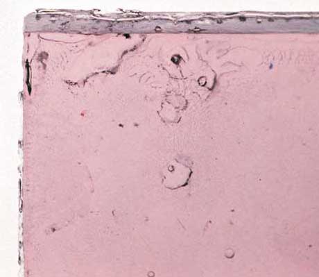
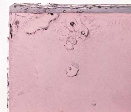
In the first image I am going to clean up dirt spots. As most of the image consists of similar dust marks, I have shown a section of the image at 100%.


Before clean up with dust spots in place.
Without dust spots.
My own feelings about this first exercise are feelings of frustration! The photographed objects appear to be of some kind of transparent substance, i.e. glass or resin. The objects have dark marks all over them but it is not clear if these are dust spots or some property of the materials. As I did not photograph the objects and have never seen the real thing, I am finding it very difficult to be sure that some of the dust spots I am correcting are actually dust spots! It can be argued that somebody looking at the end results would have been unaware of the original marks but then they are falling prey to my version of what was in front of the lens.

For the second part of this exercise I have to remove some lens flare, seen on the left hand side of the image below. I have used the clone tool in Photoshop, set to colour to remove as much of the flare as possible.

The original image with flare visible on the left.
This was very difficult to carry out as there is not always a clean area to clone from. As before, it is not always possible to see what the underlying colour and texture should be. I spent quite a lot of time doing this and still believe it was not long enough and could have been done better.

Lens flare removed with clone tool set to colour.
What are my thoughts about this though? Well this was slightly easier to work on than the previous shot as it was easier to relate to what is being shown. Removing the flare in this instance has made for a more enjoyable picture. A big part of me still thinks it would have been better to get the shot without the flare, after all, had I made a better job of the cloning would only prove that I am good at Photoshop, not necessarily photography!

Monday, 27 August 2012

Assignment 3. Monochrome

This assignment is a study in monochrome. From our previous exercises we have learnt that some subjects are better suited to black and white than others. We are looking for different qualities than we would, should we be working in colour. Here the qualities of contrast, tonal range, form and texture become important.

In the lead up to this assignment I have been looking at black and white work from other artists including Harry Callahan, Ansel Adams, Cecil Beaton and Henri Cartier-Bresson. Interesting to see the different subject matters covered in black and white.

Why I have chosen this subect
I have chosen as my subject the pier in Bognor Regis, my home town. I believe the pier offers many opportunities for textures as well as shape and form. Much more than this though, I also feel that the pier is suitable on another level. Most of the piers in England date from around the turn of the previous century. Black and white photography always raises this nostalgic feeling in me. I see a tie between the subject and the medium.

On yet another level, a pier and it's visitors in colour can be a happy and joyful place but when photographed in monochrome and in less than favourable holiday conditions and the emptiness can take on a melancholy atmosphere. This is what I am setting out to capture in the following images.

Clutter.
Pier time.
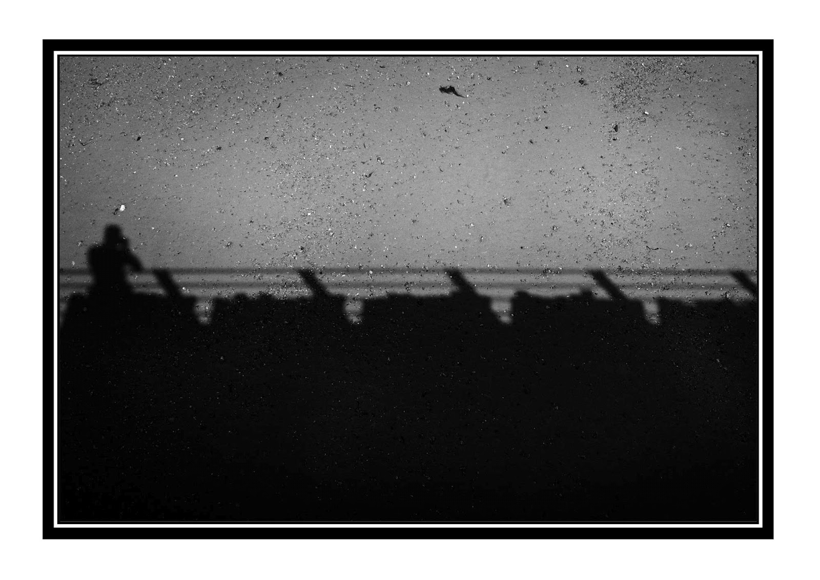
My shadow.
Walk the plank.
Holiday spirit.
Under the board walk.

Wish you were here....
Conclusion
My objective was to show a moody, melancholy side of the pier. The pier is definitely moodier in black and white than when you look at the colour versions of the photographs. Looking at the images now, I feel that I have one very cliché image (it should be obvious which one!). Maybe the weather could have been a bit more 'moody' but I made several visits to the pier and in the end had to go with what I had captured.

I am quite happy with the processing. Black and white manipulation is something I haven't carried out often. There seemed to be a big craze in the last couple of years and I hate to follow the crowds, so I deliberately avoided this genre. This exercise forced me to experiment with black and white and I did enjoy it.

Picture details
Clutter. Canon EOS 5D MKII, 35mm Lens, 1/100 @F11, iso 50.
Pier time. Canon EOS 5D MKII, 35mm Lens, 1/250 @F8, iso 50.
My shadow. Canon EOS 5D MKII, 35mm Lens, 1/2500 @F2, iso 50.
Walk the plank. Canon EOS 5D MKII, 35mm Lens, 1/100 @F8, iso 50.
Holiday spirit. Canon EOS 5D MKII, 50mm Lens, 1/30 @F16, iso1000.
Under the board walk. Canon EOS 5D MKII, 50mm Lens, 1/160 @ F2.8, iso 1000.
Wish you were here. Canon EOS 5D MKII, 50mm Lens, 1/500 @ F5.6, iso50.

Finally, below are a small sample of the images that I took for this assignment.


Sunday, 12 August 2012

A look at "Unseen Vogue"

As I have mentioned before, many of the photographers I admire have at some time worked as fashion photographers. I was recently looking through the photography book section of Amazon when 'Unseen Vogue' (Little, Brown. 2002) caught my attention. What is 'Unseen Vogue'? It sounds interesting!

The description for the book read "For every picture that has been published in Vogue, there are many that never make it - not because of poor composition or execution, but because the fashion styling may have been too inventive, the camera technique too pioneering or, frequently, because the magazine simply ran out of space"

This was tantalising enough so I ordered the book immediately and it duly arrived a few days later.

I was not disappointed. The book has turned out to be much more relevant to the course than I expected. Between the pages we find work from many of the great masters - Horst, George Hoyningen-Huene, Cecil Beaton, Lee Miller, Barry Lategan, Corinne Day, David Bailey and Helmut Newton as well as others that I will be researching further. As the description states this book contains pictures that didn't make it in to Vogue. It is incredibly interesting to see this work and the reasons for this decision. Many of the pages also contain contact sheets so we can get a view of the different poses and ideas the photographers, models and art directors have tried.

Further to all these gems, there are also notes and letters of conversations between Vogue editors and photographers. Finally, you get to see some new shots of some of our greatest models going back to the beginning of Vogue.

All in all this is a great photographers book if you have the slightest interest in fashion photography.

Little, Brown. 2002. ISBN 978-0-316-72766-2

RAW

The advantages of using RAW for image capture are generally accepted to be the ability to carry out non destructive and post acquisition editing which allows us to hold the image quality until a later stage of the image processing cycle.

This exercise is to put in to perspective how noticeable this  benefit actually is in real terms.

I have captured three images with different lighting set-ups. Each image has been captured as a RAW file as well as a JPEG (at highest quality). On my camera I am able to do this simultaneously, so both files will have identical lighting etc. To minimise the amount of post processing, I have set the camera up to give the best possible image at the time of shooting, i.e. white balance, exposure etc.

The first two images were taken in a local church yard. Very little tweaking was required on the RAW file. A little more was required for the jpeg as there was still a slight colour and brightness difference compared to the RAW version.

Jpeg from RAW file.
Edited Jpeg.
Comparing the two images at all stages I noticed the following. As previously mentioned the jpg file was slightly different to the RAW, straight out of the camera. The jpeg was darker and colder than the RAW. Some adjustment to the brightness, contrast and colour curves brought the two images into line.

After this work I examined both images at 100%. I checked for the presence of fringing around the edges of shapes and noise in the darker areas of the image. This image has a very shallow depth of field which allowed me to examine both sharp and soft area's.

An examination at 100% did not really reveal anything that I would worry about. There was no fringing and the noise in the darker areas was no worse than in the RAW version of the file. In the two images above you are able to see the slight difference in the colour tone but as both pictures have been converted to Jpeg, it is naturally not possible to see the differences between RAW and Jpeg. In this lighting situation the dynamic range of both shots is the same.

Image pair number two were shot in artificial light. For this I used a two flash-gun set-up with the main light to the left of the camera through a shoot through umbrella and the second flash to the right with no modifier except the flip down diffuser on the front of the flash. The camera was set to flash white balance and tripod mounted.

Again there were differences to the Jpeg and RAW files as they came from the camera. The Jpeg was again a flatter image and needed a bit more adjustment to brightness and contrast. In my images there was very little tolerance when adjusting the contrast. There was very little adjustment to be had between the highlight clipping warning and the shadow clipping warning. This was apparent in the white of the flowers and the black of background.

Again an examination at 100% showed very little to be concerned about with regards to the image quality. I paid particular attention to the edges of the white flower petals against the black background. It will be interesting to see if this is the case with the last two images!

RAW Conversion.
Edited Jpeg.
There are two more images needed to complete this exercise, which will be high contrast.


Tuesday, 7 August 2012

Thinking about assignment three - continued.

I have had feedback from my tutor which includes the recommendation to look at the work of Harry Callahan (1912 - 1999) prior to starting my next assignment. I found a slideshow of some of his photography here and an interview with Harry Callahan here.

Harry Callahan, by his own confession, caught the photography bug after attending a workshop run by Ansel Adams in the 1940's. Callahan worked in both colour and black and white photographing his primary subjects of the city, nature and his wife and daughter. To keep his work from getting stale, he would switch subject and camera when he started to tire from the theme he was working on.

Callahan also used 'in camera' multiple exposure and camera movement techniques in his work. Below are some examples of Harry Callahan's (black & white) photography.

To get a better overall view of his images, I carried out a Google Image search. I have seen it written that Callahan has a strong sense of line. This is apparent if you view his images side by side and is evident in all the images below, be it the silhouette or the architectural shots. Another good example is 'Chicago, 1961' which has strong uprights in the lamp post, the figure in the foreground through to the chimney, side of building and other pedestrians. Moody tones are also evident in all the images - note that I am only looking at the black & white work in this essay as a prelude to the black and white assignment.

Eleanor, 1948
Chicago, 1961
Cape Cod, 1972
Cape Cod, 1972
Eleanor and Barbara, Chicago, 1954
Chicago, 1949
Other photographs with great tonal qualities to look out for are the series of pebbles in sand and a favourite of mine, 'Untitled, ca 1953' which depicts the fingers of a hand curling round the top of a table.

Wednesday, 11 July 2012

Thinking about assignment three.

As I am working on the last exercise before assignment three, I have started to think about what I am going to photograph for the assignment. This is a monochrome task so building on the last exercises in part three I have started to look for a subject that will allow me the maximum of scope to show form, tonal contrast and texture. I also want the subject to be easily accessible so that I can visit it on more than one occasion should I need to.

So far I am considering two ideas. The first is the local pier. This gives the opportunity of  pattern and rhythm as well as tonal variation in repetitive constructs such as the deck planking and railings, the pier legs etc. To bring variety there is also the tonal range of the sky if I photograph this in a manner that it forms part of a pier view and choose the right time to do it.

My second thought is a little more abstract but something I will investigate. This will be a series of photographs of one of the pedestrian bridges across a nearby A road.  Might sound a bit strange but it has some great shapes. My only concern is being able to get enough variation across 5 to 10 images.

Wednesday, 4 July 2012

Catharine Portfolio Shoot


I did some more portfolio photography with Catharine last weekend. The location was an old ruin not too far from where I live.  The idea was to get the shots as 'fashion' looking as possible.

Catharine had three outfits and a number of accessories. For my part I paid a lot of attention to the lighting. I was using a Strobist set-up of a shoot through umbrella with a remotely fired flash gun. As part of getting the look, I set the lights to eliminate quite a lot of the shadows on the face and aimed to also get a fairly even lighting across Catharine.

Final touches were carried out in post production. The colours were slightly de-saturated and a certain amount of toning has been added. 

My influences for this type of work come from magazines such as Vogue and Harper's Bazaar as well as the online work of many fashion photographers.

Friday, 29 June 2012

Black and white

For this post I am not going to talk about the processing of the image as this was done in much the same manner as the black and white processing in previous exercises.

This shot was set up with two camera flash guns fired by radio triggers placed to the left and right of the fruit bowl. The bowl is filled with a variety of different fruits each with particular textures. To add further interest to the shot, the bowl itself and the table introduce further textures.

1/250, F4, ISO100  37mm.
By choosing the fruit and the table, I am trying to emphasize the qualities of line, shape, form and texture. There is textual variety between the plumbs, peach and lemon skins. For line we have the edges of the table and the grain in the wood. The round shapes of the fruit are good solid primitive forms that are well defined by the contrasty unmodified light. The varying secularity of the different fruits also helps to define form. The light rim of the bowl near the bottom edge of the picture is contrasted against the shadow cast by the same.

I think I maybe should have framed the shot a bit tighter - I have already cropped it down to lose some distracting features in the background. Exposure in this situation is partially dictated by the use of the flash units.

Monday, 18 June 2012

Colours into tones 2

In this exercise I have attempted to increase the 'depth' of a photograph by working on the tonal range of the skies. The workbook suggests that I take a landscape photograph but as the weather has been so bad, I have had to select an image from my existing captures. The picture I have chosen does have the characteristics that I would have aimed for, i.e. a wide angle shot with a good sky and some foreground interest.

The first image serves as a reference image. This is a straight conversion to black and white in the software with default settings. The end result is again a fairly flat image. The blackest blacks are not totally black although there are some proper whites.

Here is the default conversion...
A default conversion by the software.
To create a more interesting shot and one that fulfils the brief, I have started with the default conversion and further worked this. After some initial tweaking of the contrast and blacks and whites to enhance the image, I set to work on the skies.

To create the depth I really needed to draw the eye to the sky area and emphasize the cloud layers. Most of this was achieved by working on the blue and aqua sliders. After some adjustment I was able to return to the exposure slider to brighten the image back up again. This allowed further tweaking of the image.

The end result can be seen below.
Conversion to emphasise depth.


Much as in the previous exercise, I was able to push the processing a very large amount. We are again deviating from reality but in black and white this seems more acceptable.

Thursday, 7 June 2012

Colours into tones 1

The original image used in this exercise was taken with my film camera and colour negative film. I then scanned the negative into the computer which resulted in these lovely vivid colours. This provides the perfect tonal range for this experiment where we will be lightening and darkening the grey scale tones of the dominant colours, in this case, blue and yellow.

The original image.
Before starting work on the individual colour tones, I have carried out a standard black and white conversion using the software defaults. The software conversion is very safe but not very exciting and can be seen below. This will serve as our reference image.

A standard black and white conversion by the software.
The first edit (below) emphasises the yellow tones and subdues the blue areas. As can be seen by the inset settings panel, several sliders have been adjusted to maximise the effect.  Yellow, green and orange have all been  reduced to darken the yellow tones. The blue and aqua have been increased to maximum to lighten the sky area. The resulting image can be seen below. It has been necessary to adjust more than just the main colour as different shades start to spill over into other colours.

Darkened yellow tones.
To reverse the tonal range from above I have now minimised the blue and aqua controls and increased the yellow and greens. This has produced the strong 'negative', almost 'infra-red' style image below. Note how the sky area in the image above is much larger than the equivalent dark sky area below. In both conversions I have tried to get the contrasts as extreme as possible without losing any detail. I have allowed a tiny amount of clipping in both the blacks and the whites.

Darkened blue tones.
Conclusion.
Creatively there is a major difference between these two images. The image with the darkened yellow tones is maybe a little extreme but nether-the-less still a realistic black and white rendering of the original. The picture with the darkened blue sky is abstract and surreal. Here we have changed the meaning of this image from an unusual view of a group of trees to something other-worldly.